Player Health and Core Health Polish
Author: Yashwant Patel
Problem:
Since the start of the game we've had placeholder UI for many things including the player and island core health. While this did give player feedback on the player's and core's remaining health it didn't have any polish to it which would make the player feel like this is an uncomplete game. So it was time to rework the UI a little bit. After talking it out with the team and looking at some design mockups from Patrick we decided to have circular health bars/ globes for the health.
Solution:
First thing to do was create the textures that needed to be used in Photoshop in order to use them in the game and I could get a rough idea of what it would look like in the game.
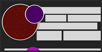
Red circle is player health. Purple circle is island core health. Background is Patrick's mockup
With the basic shapes and textures in Photoshop it looked decent, now it was time to import these textures into Unreal and start working on the shader. The first thing to do was create a shader that supported a circular texture, so I just took the red circle texture (exported as white, so color could be changed in editor) and fed in the alpha for opacity and the rgb multiplied by a color into the color parameter. Now the second step was to have the white dots pan upwards like bubbles.

Example of how it looked in game.
The fix for this was to make this more fluid like a wave. Now a sine wave would perfectly do the job here, but for now I had another idea in mind, which was to take a noise texture and use it's values to tweak the shape of the circle and make it more fluid. In order to achieve this switched out the texture sampler for a sphere mask and fed in some noise for the a parameter with a center of (.5, .5) and radius of .5.

This produced a more organic shape, but there was still an issue.


This was better, but the straight edges needed to be removed, so time to add a sine wave.

In order to create the foam the same process was followed with the linear gradient added with the sphere mask, but instead it was offset depending on the foam thickness parameter.

Much better! Time to see it in action.
Using this material a dynamic instance was created and the fill percent scalar value was edited when the player took damage.
Also added a nice little lerp, so the health fill didn't immediately jump down to the new health upon taking damage. This looks good, but there's still more polish that can be added. Currently the health looks flat and not like a globe, so it was time to add a globe texture on top of the health fill.

This made it look less flat, but the fact that the green fill is still a flat color makes it look somewhat flat. In order to mitigate this issue I took the same concept from the island core shader and used a Motion_4WayChaos node.


Comments
Post a Comment